Hi there! Today, I want to share a simple technique of painting fabric texture on miniatures.

Easy way of adding interest to textures when painting miniatures.
Let’s dive in and discuss how we can make our materials look more interesting. I’ll guide you through my process and show you how to take your fabrics to the next level!
First, we will inspect Grinder, who has a red ribbon tied around his top knot. Then, we will move on to Wraith and Viking Chief, as the technique varies slightly.
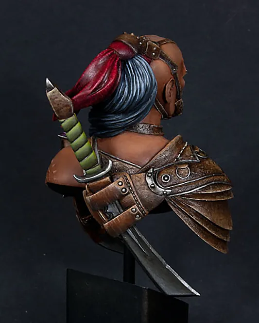
Grinder’s red cloth:
In the beginning, I was going for plain and smooth red. I did all the lights and shadows as smoothly as possible. Then I realised it didn’t look good enough. Especially when I compare it to the leather elements. Besides, it’s almost a sin not to try some freehands with this scale.
I noticed that the folds and recesses of the cloth looked almost like feathers. So I thought about emphasising it with adequate freehand, but then I worried it may look too girly. And Grinder is anything but girly, so finally, I decided against it. Then, I thought about a simple fabric pattern. It shouldn’t be too difficult to do and should look real/believable enough.


I had only a general idea of how to get the effect I wanted. So I jumped into deep water. I took the brush with a bit of ‘Jack Bone (P3) and started to paint thin lines on the brightest parts of the cloth.
Why ‘Jack Bone? No idea, honestly. It might be because it was already on the table, and I was too lazy to look for off-white. I genuinely doubt there was any clear thought behind it.
Of course, not every line was nice and thin, but I decided it was OK. Sometimes, manually woven fabrics have thicker threads as well.
I did some red lines on the bright areas to keep the fabric nicely red. It helped to create even more contrast between threads. Then, I used the same red to create light threads in the shadows. And finally, I also used some Leviathan Purple/Druchii Violet (GW wash) to make dark threads there. After a while, I added a few beige lines in the shadows at the back of the cloth in the shadows.


When the threads were almost done, I applied a layer or two of red ink (Deep red W&N). After a few more touch-ups and corrections, the cloth was ready.
As you can see, the red ink changed the hue of red quite significantly. It’s now a colder shade of red, which I quite like.
Using wash instead of ink would also do the trick. I’d need a few more layers (as inks have more pigment than washes while still being transparent). If there are washes with such intense pure red, of course.
Colours I used to paint the cloth:
OK, so I used Oils for the first part of the painting, and I have no idea what colours they were. If I did it in acrylics back then, I would most likely use:
- Flat Red (VMC 70957)
- Burgundy Wine (Reaper Master Series Paint 9025)
- Black (VMC 70950)
- And the colours that I did use for sure:
- ‘Jack Bone (P3)
- Flat Red (VMC 70957)
- Leviathan Purple/Druchii Violet (GW wash)
- Deep Red (Windsor & Newton Ink)


Wraith’s blue mantle:
For this piece, I was planning to do a mantle full of mystical symbols and signs… But I was too afraid I’d spoil the paint job, so I decided to do something simpler.
The technique I used here is pretty much the same as with red cloth on the Grinder. First, I made sure that the blending was smooth enough. I wasn’t overly worried about the contrast yet. I knew I’d increase it further with texture and glazes at the end.

When I was happy with the base, I painted thin and faint white lines all over the mantle.

After that, I used some turquoise glazes, followed by turquoise lines and more glazes. I decided not to introduce really dark lines in this piece. The whole mantle should stay relatively light in colour, ethereal. I tried to do the lines thinner than on the Grinder as well. Mainly because the mini is much smaller. I didn’t want the fabric to look fake or extremely thick-weaved.

Colours I used to paint the mantle:
- Off-white (VMC 70820)
- Blue-green (VMC 70808)
- Medium blue (VMC 70963)
- Black (VMC 70950) – used extremelly sparringly only in deepenst shadows
As a side note:
The noticeable differences in the hue of the cloak are mostly the results of my experiments with painting. And only a slight inconsistency with lighting.
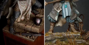
Viking’s grey cloak:
I used the same technique while painting Viking Chief.
You can see a few steps in the photos below:
First clean base. I painted it neatly enough, even knowing I would cover it with texture later. Then, I did initial lights and shadows.


Then, I painted all the thin lines, in this case, light and dark. I chose the colours corresponding to the base to increase the contrast and make it look natural.

After that, I painted layers of glazes to unify the whole coat. The glazes are integral to this process, making everything look coherent.

Colours I used to paint the cloak:
I can’t remember what colour I used for the base for the life of me. All the time, I was sure it was some grey-blue, possibly French Mirage Blue (VMC 70900). But after looking at the paint right now and comparing it to the photos, I realised it’s not it. I honestly don’t remember. So any blueish colour would do. I basically covered it with texture anyway, so it’s barely visible.
The rest of the colours are as follows:
- Off-white (VMC 70820). I used the pure off-white only in the highlights on his shoulders. Everywhere else, it was mixed with French Mirage Blue.
- French Mirage Blue (VMC 70900) – I’m sure I’ve used it for texture.
- Basalt Grey (70869)
Here are a few general thoughts on how to paint fabric texture:
How do I choose the colours for my textured fabrics?
The easiest way to answer this question would be to say: I pick colours that would naturally be highlights and shadows. That would be boring, though. I usually introduce at least one colour close to the main colour scheme. It is close but not what you would imagine as natural light or shadow to add some interest. I don’t add intense colour variation, just a bit of interest. You can add bolder colours in your texture if you want, but it might be distracting.
The only challenge of this technique:
This way of adding interest to your miniatures is relatively simple. It requires only a brush with a good tip and patience. Well, a lot of patience. In fact, the sheer amount of work to make all the thin lines in at least 3, ideally 4 colours, might be the single biggest challenge here. Especially if you decided to try it for the first time on a big area. Start small, and you won’t get discouraged;]
I hope you found this article helpful and are excited to try these techniques and see what you can create. Don’t be afraid to try new colours and textures to make your miniatures stand out. And hey, if you have any other techniques you’d like me to cover, let me know! I’m here to help you take your miniature painting skills further. So, keep painting and have fun creating!